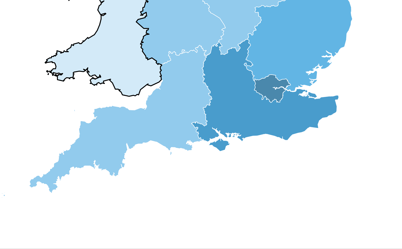
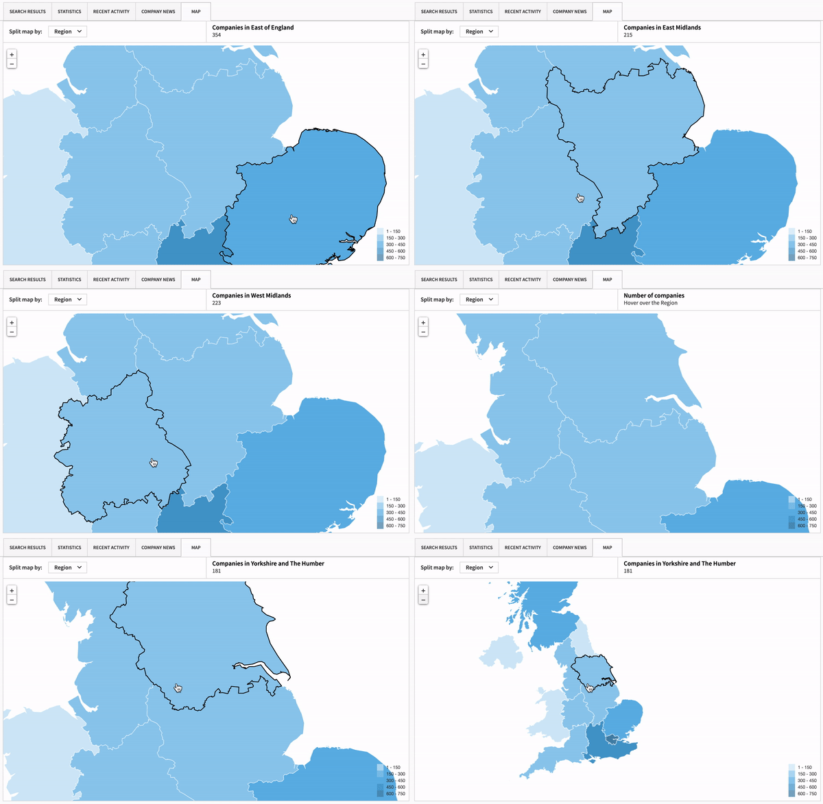
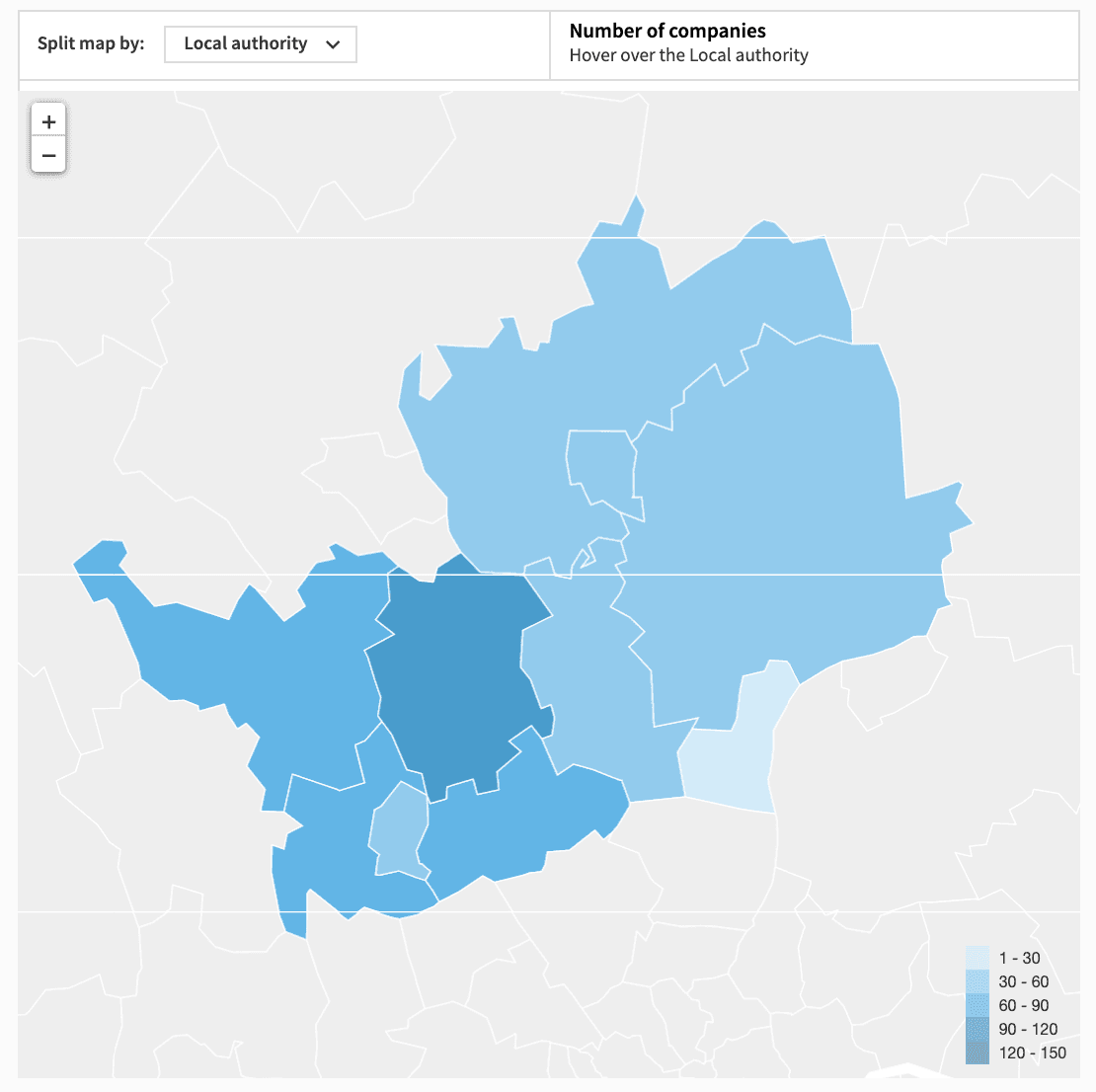
The map shows you the number of companies that meet your search criteria, broken down by country, region, local authority or local enterprise partnership (LEP), so you can compare and contrast areas of interest.
Colour scales across the map enable you to differentiate between areas of high and low concentration, meaning you can quickly identify strong performing regions and interesting outliers. This simple visual breakdown is ideal for client presentations (subject to our data policy), and you can tweak your search criteria to showcase your area’s strengths!
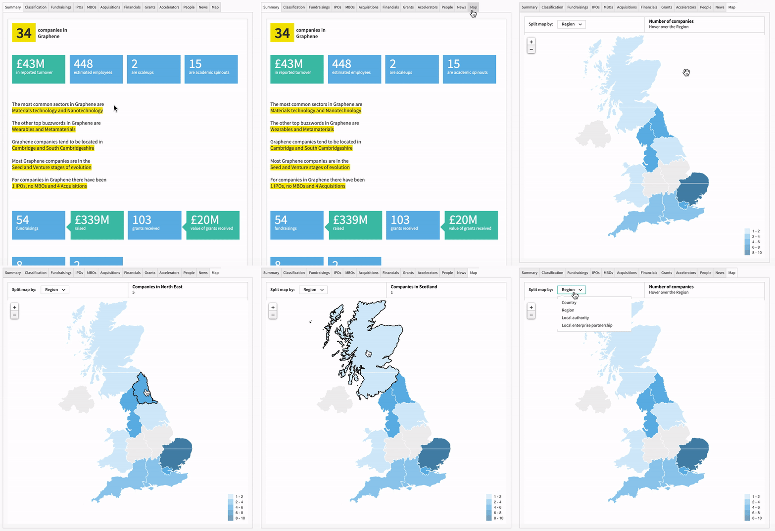
What’s more, by hovering over a section of the map, you’ll access the data behind it, and see in exact figures how many companies relating to your search have been identified in that area.
Understand markets at a glance
The Explore feature is always the best place to start when brushing up your knowledge on a particular sector or buzzword, as it provides you with key facts and data relating to that area.
Previously subscribers would run multiple searches and exports to conduct regional analysis. But now, with the addition of the interactive map, you can easily see how companies tagged with a sector or buzzword are distributed across the UK, all on one screen. As with any instance where the map appears on the platform, you can further refine by country, region, local authority or local enterprise partnership (LEP).
This is an effortless way of having a quick overview of a sector, without having to conduct any in-depth searches – ideal for when you want to understand markets at a glance, but you aren’t looking for anything specific.