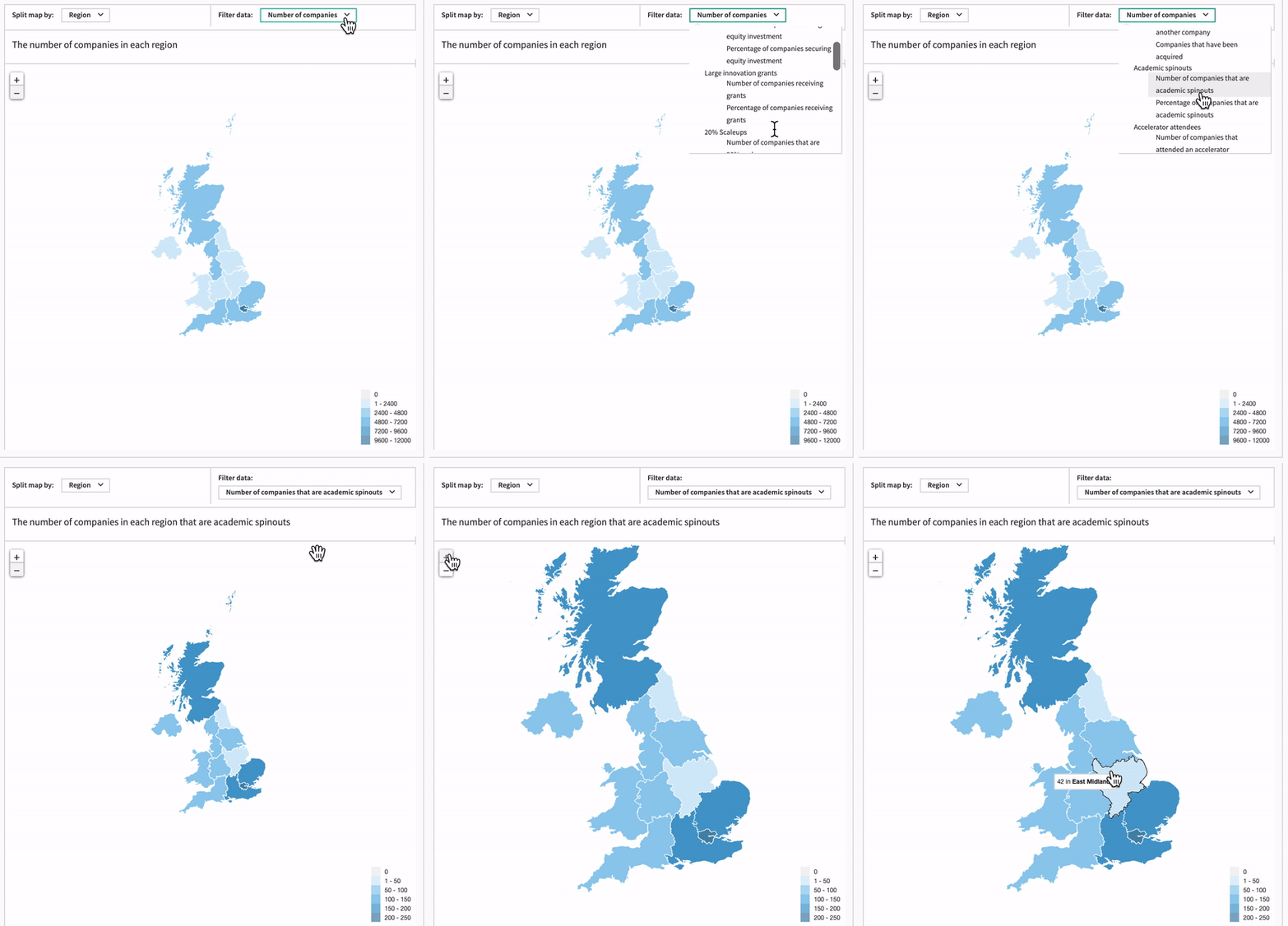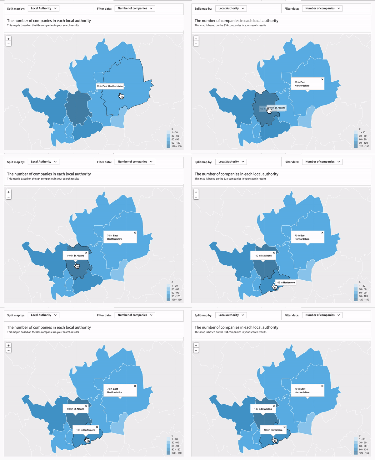
We recently announced an exciting update to our platform – interactive maps. The new responsive maps appeared in our Explore pages and Advanced Search results, enabling users to understand markets and identify areas for new business with just a glance.
However, never ones to rest on their laurels, the product and development teams have been hard at work and are pleased to launch an even more powerful version of the map, enabling you to see more data and conduct more in-depth analysis of your region or sector of interest.
Report on your portfolio
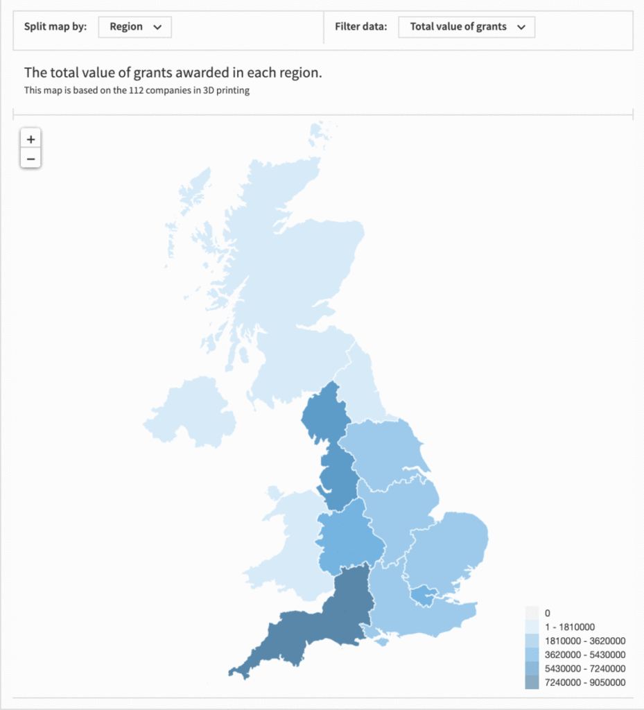
First, we’ve added a host of new data to the map, including number of acquisitions, spinouts, accelerator attendees, fundraisings and grants, in addition to the number of companies that meet your search criteria.
This is the perfect way to visually track your portfolio, whether you’re a university following your spinouts, a fund manager analysing the efficacy of your investment by region, or an accelerator checking up on your programme’s cohort. For example, of the companies that attended an accelerator, how many per region went on to reach the growth stage, raise over x amount, or to be acquired? For a more in-depth search, how does this compare to other accelerator programs?